


The idea of creating flowers in waste paper - to our reader Maria Rita Giovannone, architect - came when, looking for a card to do a little decorating for his daughter, he observed a roll of paper towels and crushing it, he glimpsed the shape of a "petal" which assumed. Then he thought to reuse the rolls of toilet paper, even easier to work with. Thus, the first two imagined flowers, was born the 'idea of getting a real "floral pattern" to decorate a wall of his house, decorated only by many framed photos ... no furniture. The idea is therefore perfect for passageways where there is no such much depth to put the furniture. Here are the necessary material and photos of the various steps.
What you need if you want to do it too
- Rolls of toilet paper cardboard and paper towels
- Ruler
- Pencil
- Scissors
- Hot glue gun (20 sticks refills cost approximately 5 euro)
- Acrylic enamel spray gloss black (about 2, 50 euro per jar)
- Acrylic enamel spray transparent glossy (about 2, 50 euro per jar)(rolls of paper ... we recycle them from big rolls paper towels and toilet paper)
- Chiodini (for wall fix) and hammer


Required materials: cardboard rolls of toilet paper and kitchen paper to be recycled, ruler, pencil, scissors, hot glue gun (20 sticks refills cost approximately € 5), acrylic spray gloss black enamel (about 2, 50 euro per jar) , glossy transparent acrylic spray enamel (about 2, 50 euro per jar), nails (to fasten them to the wall) and hammer.

Crush rolls of paper.

We mark on one side of the rolls, large and small, of parallel lines; to make them well-parallel, just mark it with a pencil two 1 cm dots files and then join all pairs of dots on the same line with a ruler.

We cut with long lines and we get attention all the same stripes, our petals.

We position the petals to form our flowers, 5 or 6 petals.

We glue the flowers combining the tips.

Among the larger petals we can be inserted with smaller by cutting in half some, to create more articulated flowers.

Once you made all the flowers, put them together and we color them with the spray paint, making sure to cover well with the color on all sides. Or you can leave the lighter shades. In this case siè used black. We wait for it to dry the spray and repeat the same operation with the transparent spray polish, then always waiting for it to dry well.

Once dried flowers, you can start to compose floral texture, combining with hot glue the petals (putting a little 'glue on a small portion of the petal and uniting it to the next flower).

The compositions may have the most various forms depending on the tastes, needs, the will to or less than a minimalistic design or very dense and complex. The fix in the outer parts with tacks. As the wall will fix the small compositions, we will join between them with a little 'of hot glue, combining the flowers, so as to achieve a continuous texture.
One of the most fascinating parts of Interior Designer or architect is to create not only your own projects and help the people, find the best out of their place, but also to see, how you manage your partners in this area to solve a similar problem you have. The challenges that most often comes in this area for all - a client with a small budget or a customer with a small space. Sometimes even in the combination of the two. There are a ton of ideas for the apartments, which are comfortable and bright and livable, while to have another one not so much space, but you have to know what to look for. Today we share a great example of a small room, which use up to a light and airy feel and a simple design features, which can be easily reached, and cost a fortune. Together with the Interior that we share today, are we a to share DIY ideas from a few details, you can see in this apartment.
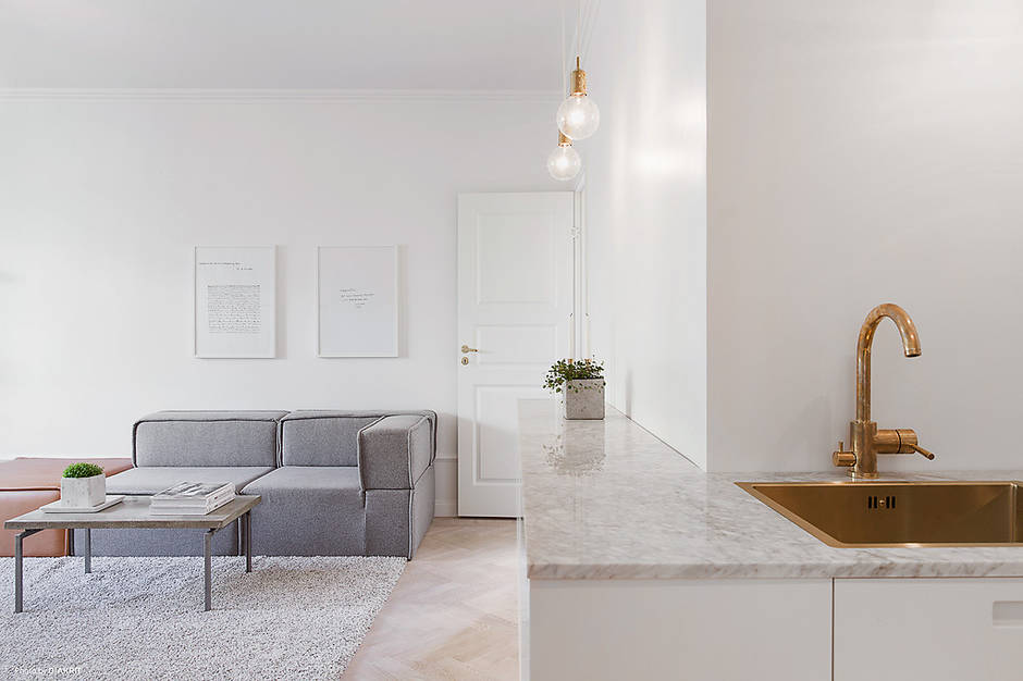
In the upper photo there are some counters for storage that go along the wall and is an extension of the kitchen counter. The countertop looks like granite / marble, but can be achieved by choosing a veneered MDF plate and's sticky paper covered with a contact that has your desired pressure. You can learn how to create it here. The lights here can be found, only a brass sink fit, can this easy spray paint matching colors at almost any hardware store.

For contemporary space give a classic look you can add a kick plate that is a little thicker with a simple trick, as shown here and here.

For a lighter look in the living room, trying to install a floating shelf system that does not obstruct not the aesthetic views of the wall. You can find an economical choice of these in any IKEA or just to the craft trying to make like this clever post here and here showed it yourself. To remain in the vicinity of Scandinavian / Nordic look, you should not clutter your room with too much details and objects and a colorful palette. The main idea is to make a monochromatic palette in a balanced and to decorate and to reduce the decor to a few essential details.


What makes it feel clean this room, engaged in a bright palette are airy, light and yet inviting -, non-cluttered collection of color and a matching colorful graphical beds placed it and add a few of your personal details, as for example a video tape.


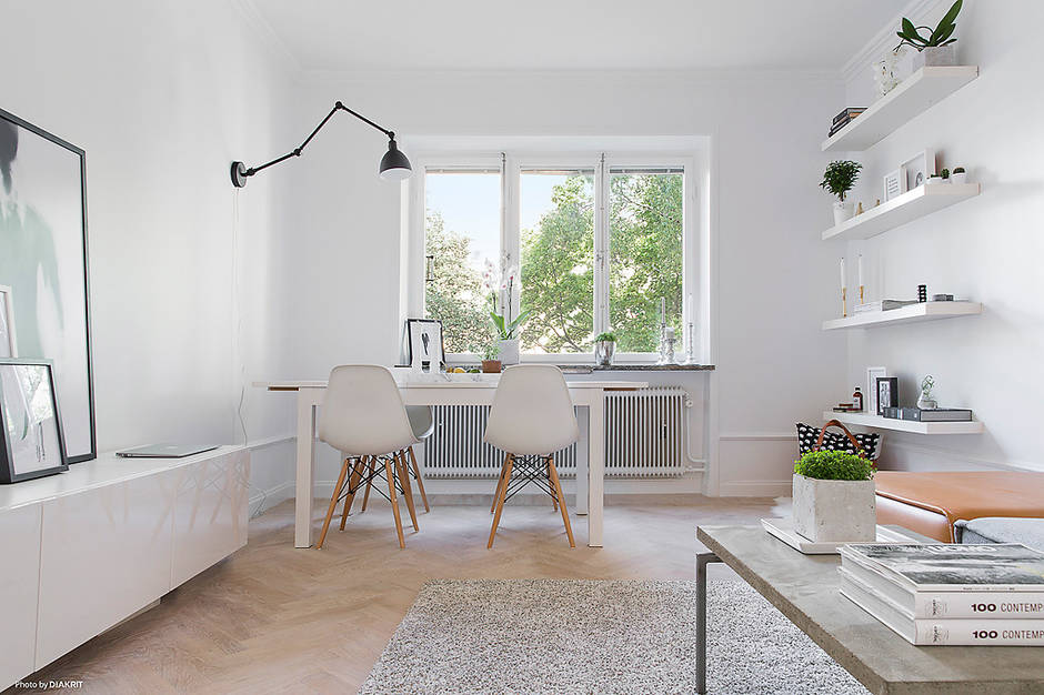
The 1910 town house in the Hague has been renovated by a Dutch architect Antonia Reif. The former room consisted of two separate apartments. It was the main requirement of the customer, have an open area, to the feed working and living areas, so the architect combines, connected, the four floors in a single device.He opened also an atrium in the Middle, and a new staircase installed. There was a sense of continuity, oak parquet floor in the herringbone pattern in order to create. Silestone has been used to create the kitchen island with integrated sink and stove. It is located in the middle of the atrium. A staircase extends from the kitchen to a lounge and study room with a bathroom on the first floor and bedrooms on the upper level.


In the Studio of the artist based in Mexico after a look by at103 + Tatiana Bilbao you feel suddenly calm and minimalism to cross your mind. The clean lines create the aesthetics and balance, which this project takes an integrity and creates. When it comes to planning the project, surprised by its size. The project has an underground car park and its by a building made with 3 levels (triple-height, offices on the third level, and a service area on the roof), with a very specific architecture program. There were two conditions. On the one hand Studio be used as, and on the other hand, to serve as venue for private temporary exhibitions.


The rooms are painted in a white, who completes the room and the look is fresh. Through the large Windows allow natural light into the rooms and freshness brings much to get. The project conditions open even in the middle of the room, the East and the West side, this will allow on the premises of the trees and gardens look.


The furniture in the inner project complemented, which creates a connection between the Interior and architecture. The sunlight has a very warm feeling that this room is required. The green nature allows to get some more character outside the room and makes it come alive. The concrete cantilevered structure contains the Studio and offices, which overlook the main room of the exhibition space. This project is interested primarily in its spatial qualities, then in the programmatic terms itself, due to its varied and disparate events. The whole building is used in white concrete.


The project is an example of a minimalist interior design and architecture. The lines and shapes create an integrity. And along with the right furniture and shades of green, it is a large, lively and full of life.

